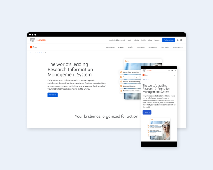
A refreshed, user-journey optimized homepage
Ontario Securities Commission
Get Smarter About Money is Ontario Securities Commission’s investor facing arm of the securities regulator. It is used to educate the public about financial literacy with a friendly, approachable, and light-hearted tone of voice. The homepage fit this tone, but offered too many choices for the user and many of the key offerings of Get Smarter About Money were not easily accessible. By cutting back the number of links and illustrations, and presenting key offerings higher up on the page, the homepage presents a clearer, more concise introduction to the website and its benefits.
Skills
UX design
UI design
Role
Lead UI designer
The challenge
Long stroll time
The webpage was too long with too many animations. Therefore, the content at the bottom was often times being ignored.
Buried key offerings
Key product offerings were buried at the bottom of the page and within sliders, making it hard for users to find them.
Too many links
Too many CTAs was cannibalizing potential conversions offering too much choice for users.
Not customizable
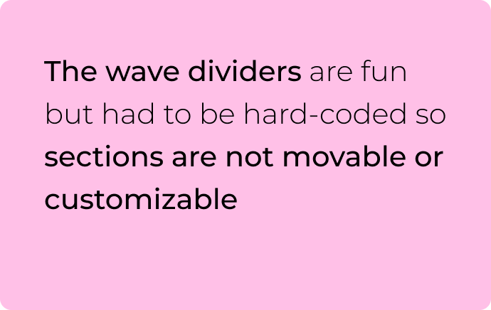
Wave pattern dividers were hard-coded making it difficult to customize the homepage and move sections around.
Goals and objectives
Assess
Assess the current content strategy of the website to find out what is working and what is not.
Create
Create an optimized content and visual layout with additional components and patterns that uses space efficient.
Deliver
Deliver a refreshed homepage with an optimized content strategy with efficient use of space and gets users to key product offerings faster.
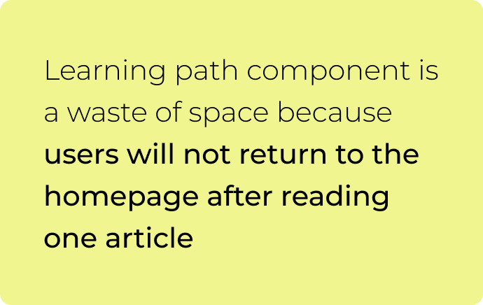
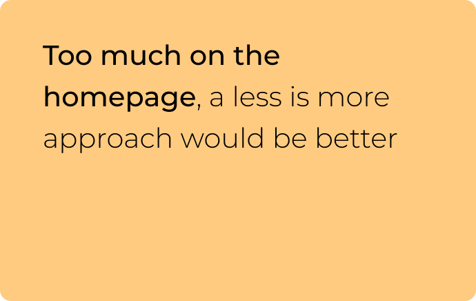
Key research insights








The process

The solution
Credits
This project was completed under the employment of the Ontario Securities Commission.


