Streamlining the application booking experience with efficient information delivery
Booking.com
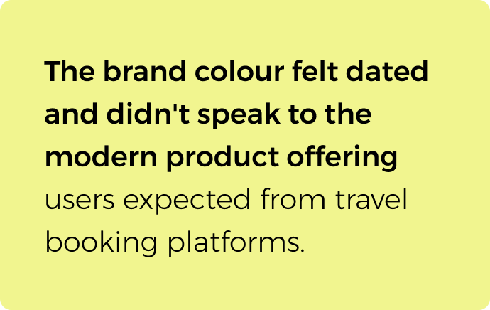
Booking.com is one of the largest travel booking sites in the world. Users can search and browse accommodations, flights, or car rentals and book right on the website or mobile application. However, the accommodation browsing user journey on the mobile application is clunky, and packed with too much information that is presented in an inefficient manner. Focusing on the mobile app, a holistic overhaul of the accommodation browsing experience was conducted. The process has been updated and improved through clear listing differentiation, timely information delivery, and improved visuals.
Skills
User research
User flows
Wireframing
Prototyping
UI design
Role
Lead product designer

The challenge
Simplify Information delivery
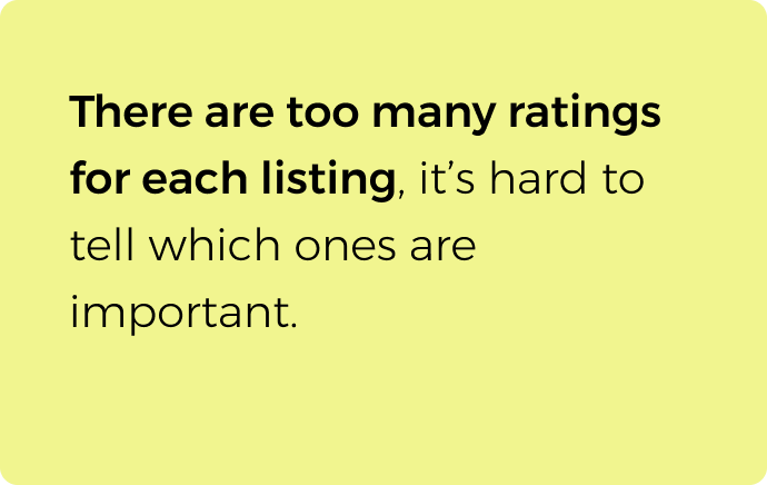
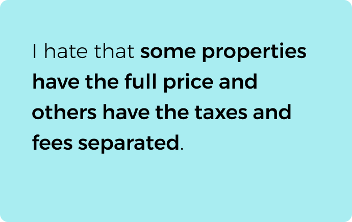
The listings are cluttered with too much information which makes it hard for users to distinguish what is most important. Make sure the necessary information is clear and accessible when needed.
Differentiate listing types
It is important for a user to understand the type of listing right away to avoid confusion. These different listing types should be clearly distinguishable early in the browsing process.
Declutter User flows
The user flow of listing is confusing at times with repeated information, multiple links leading to the same pages, and unnecessary pages for different listing types.
Key research insights



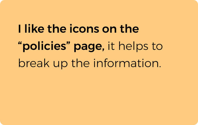

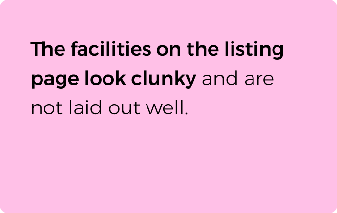
The process
User flow
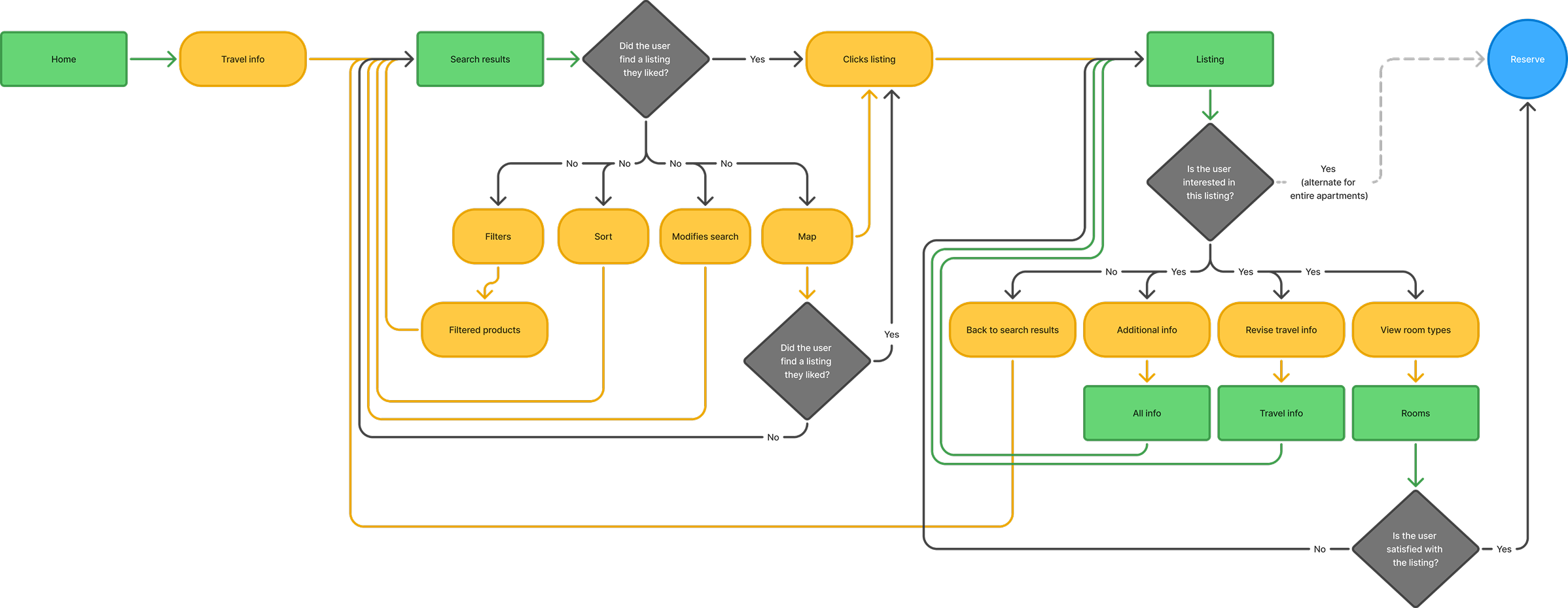
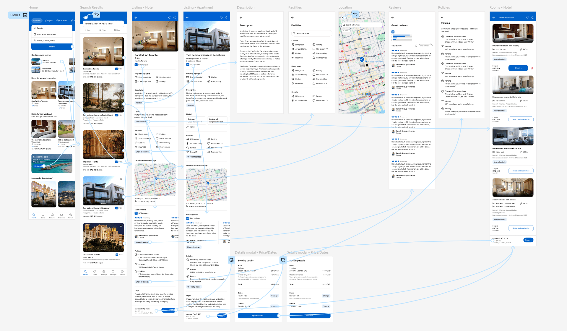
In order to understand where user errors were caused, it was important to do an audit of the user flow to see what key decisions were being made where and what could be improved upon.
Key findings
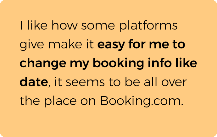
- The user needs the ability to update their travel info at any point in the journey.
- The multiple types of listings (ie. hotel vs. apartment) has a different user path. The different types of listings need to be clearly differentiated throughout the user journey.
- The apartment journey does not a “rooms” page and can proceed straight to the “reserve” page after the “listing” page.
Wireframing
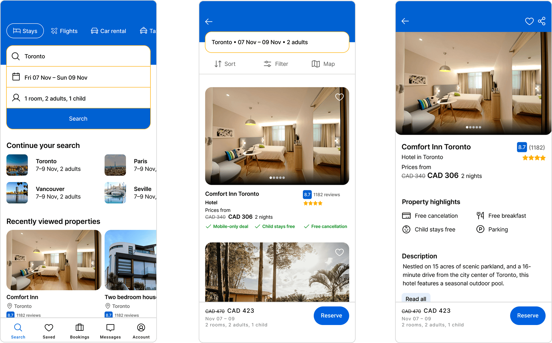
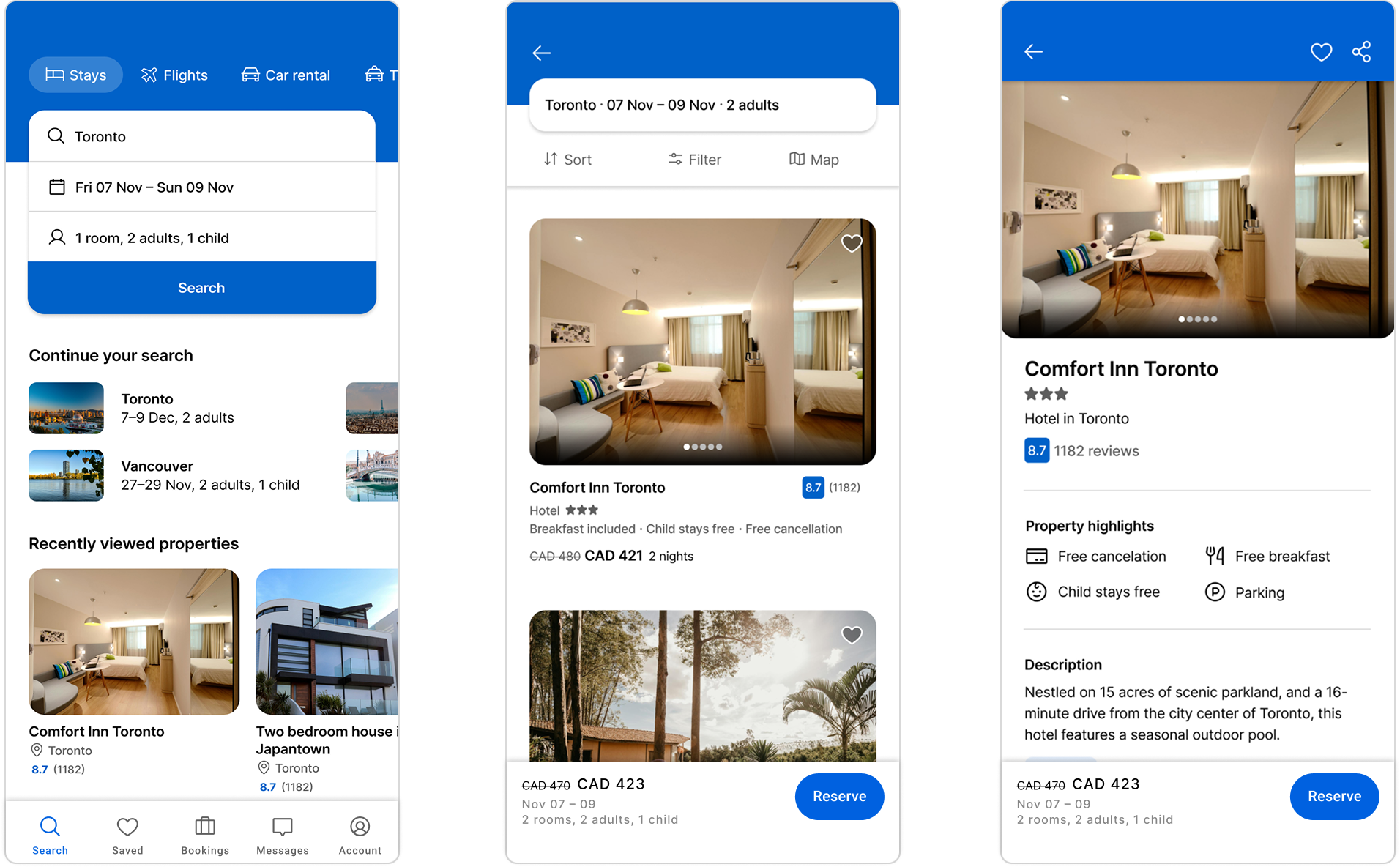
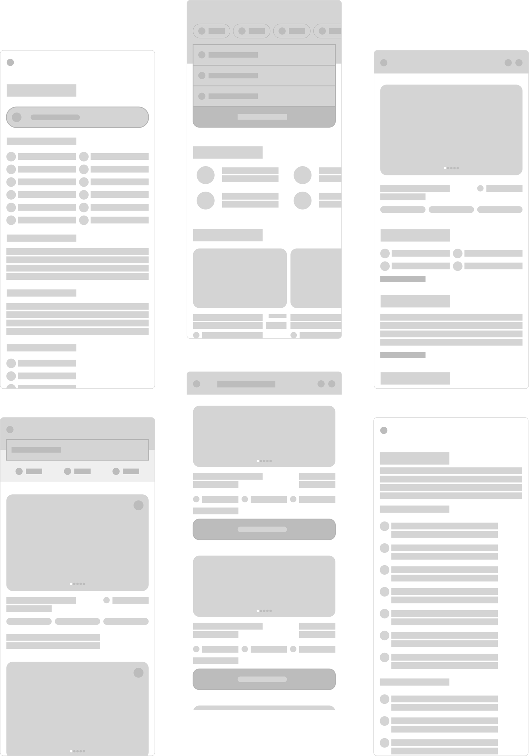
The previous layouts were very text heavy with too many features highlighted at each stage in the journey. The revised layouts focused on only highlighting what is necessary at each stage, larger imagery, and overall simplification of the layouts.
Prototyping and user testing
A hi-fidelity prototype was built in Figma that allowed testing of the revised layouts and user flow. This was used to adjust and correct any assumptions that came up in the design process and improve on the overall design.
Key findings
- Even after simplification, layouts were too busy with colour callouts and were distracting to the user.
- The hierarchy and spacing of typography and symbols was not clear enough and made the layouts too dense and difficult to scan.
- Align spacing of cards and typography to make sure every layout has the same density.
The solution
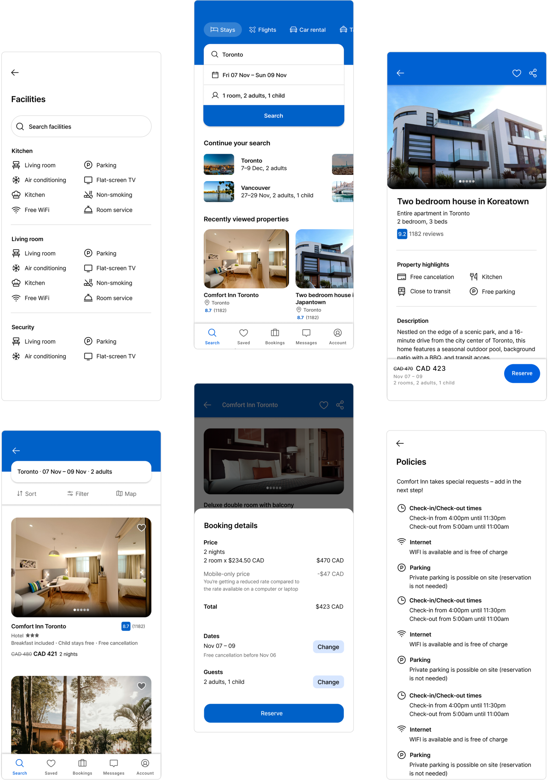
The end result is an accommodation browsing process that is more efficient by cutting out the noise and only providing the most important information at each stage. The user flow has also been improved by differentiating between the different types of listings early in the process and providing a clear flow to accommodate the varying listing types. Lastly, by presenting the ability to check and update their travel information at any stage in the browsing process with a sticky bottom menu, the user can easily adjust their preferences for a fluid booking experience.
Components
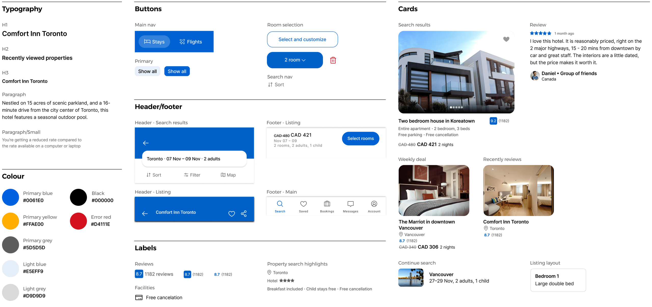
Components

Credits
This project was a personal project and not affiliated with Booking.com.


